Design Philosophy

The design of the inside of a home, office, school or any building should revolve around the people that frequent these places. Everyone should feel comfortable, that they belong and that every aspect of the design suits the purpose of the building and the structures filling the interior. A design should change the mood and mindset of every person in its own way, making their day better or changing the way they look at the world is as much a part of design as any other aspect. Frank Lloyd Wright was a man of exact precision, and I have taken many of his own design philosophies into consideration when contemplating my own designs.

Monday, February 3, 2014

Teamwork: Finding growth in Habitat for Humanity home design 


Building and designing a house for Habitat for Humanity was an interesting experience. Trying to maximize usable space while still keeping aesthetic and likable design is a tough lesson many cannot fully comprehend. As a first time designer of Habitat for Humanity, I found the experience to be eye opening in space planning and flow of movement through a space. Finding appliances that work well, are energy sufficient, and are relatively inexpensive was another big challenge. I think that overall this design was done successfully in creating a space that a young, growing family can bond and bloom in an environment that promotes a healthy living lifestyle. Separating the parent's from the children's rooms was done to separate the family when time needs to be spent apart, while the bottom floor is equipped for family time and social gatherings. 

Thursday, December 5, 2013


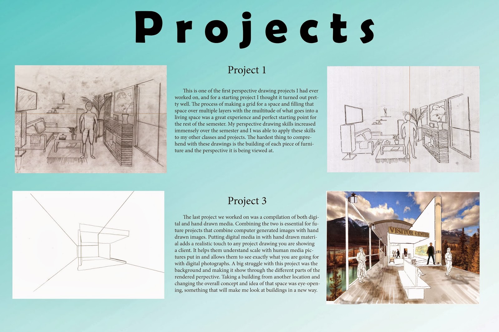
Over the course of the semester I have learned an incredible amount of information and skills in drawing, rendering and everywhere in between. Drawing has always been something I’ve wanted to be better at, so opportunity arose when I learned that ID 205 was based in drawing and drawing techniques. I have learned how to properly form a perspective drawing, by plotting a grid, filling that grid with structural components and then filling it with furniture, people and other elements of design in order to create an in-depth visual that is clear and informational enough to express my ideas for any space to a client or coworker or anyone for that matter. Using these drawing skills we have re-purposed spaces and come up with new ideas for already built plans and we have implemented digital media into these visuals in other projects. Sketching constantly and learning to master the art of rendering a visual concept has furthered my visual creativity and has forever changed how I view the designed world we live in every day. Although I have struggled with many of the drawing tasks I have done my best to express an idea clearly enough for any person to understand my concepts and implement my mind’s creations and put them onto paper. I haven’t noticed how much my drawing skills have increased over the course of the semester until I took a look back at all of my past projects and see how far I’ve come from just a few months ago. I believe that if a client was confused on an idea I was expressing verbally I could most likely show them through my drawing abilities that I have gained over the past few months spent in this course. I cannot wait to further my drawing skills and see how far I can take them, and see how far they can take me in the design world. 

Friday, October 25, 2013

Building the home for Habitat for Humanity was an amazing experience I mean that in all honesty. I had such a great time working with all of my classmates and the other volunteers constructing the roof and putting up some of the trim edge work on the side of the roof. I have never worked construction but I loved every task I was put to. I loved how hands on everything was, most people think that building a home is confusing and something they could never be a part of, but I think everyone is capable of helping build and construct the frame for a home.

I would highly recommend working with Habitat for Humanity for anyone interested on any type of design. Very interesting how everything is put together and the process that takes a foundation to a frame to a home! I got to work on the hurricane ties on the side of the house that makes sure the roof and the outer frame do not come detached from the walls in the event of heavy winds.


Saturday, October 5, 2013

Sketch Crawl

                The sketch crawl was my second favorite activity we got to be a part of during the Seattle trip. I learned that quickly and efficiently sketching out the basic layout of a space then filling that space with the details is actually quite a bit better then starting with the details and drawing out from them. I started drawing things that were directly in front of me but by the time I had moved back to the backdrop of the drawing everything was slightly out of proportion. I asked one of the field sketchers for a tip on how to show relative size and get a better sense of proportion in my sketches and he told me to add people to my drawings, which surprisingly I never thought of! He pushed me to fill the space with things that people easily identify and can mentally image automatically to be a certain size and make them pop to show a better, more proportionate view of a landscape or interior. I will apply the tips and lessons learned on the sketch crawl to the next batch of sketches we do in class and see if they improve!
Job Shadow: Interior Architects

                The Job shadow was easily my favorite part of the entire trip! I learned so much and it was refreshing and relieving to see the tactics and methods we learn in class used in the modern workplace! The job shadow made me realize that everything eventually comes together to make a final product. I guess I personally don’t think that far ahead but in firms today the final product is your grade in real life and is taken extremely seriously. I think I will start to plan out everything I have to do for each project so I can better plan out my time. All of my energy goes into the wrong places for projects and I need to deconstruct projects in my head and better visualize where everything will go and how everything will cooperate with other aspects of my project to better my final product. It was challenging to hear that Amanda, one of the many bright minds working there, was working on multiple projects at once. But it was relieving that the company came up with ways to work around these multiple projects and make sure both get done on time. I think my biggest struggle so far is not necessarily multitasking, but applying myself in order to get multiple projects done in the same week. I am so happy to have toured IA, I wish I had more time to just sit and watch the process work being done .


Frye Museum

                The Frye museum was next on our list of activities. The entry’s effect depends on which entry you choose. There is an entry that goes into a small waiting room then into the main lobby, but the one I chose to focus on was the ADA accessible entry way. The entry way glides up a steady slope with a beautiful modern art piece standing in calm water to your left, which adds a physical trait to the building of sleek modern design. As soon as you enter the building however, it turned into a golden section type dome with two large windows stretching high on either side flooding the doorway with natural light. There was also a skylight put into the top of the dome like structure that floods the main passageway with light and causes you to venture further into the museum. The entry way was definitely my favorite part as I could see all of what the designer was describing to us in clear form. That being said, the rest of the interior was bland and rather boring. This may be due to the tour seeming to end shortly after the entry way, but I saw little to no architectural integrity throughout. I did see a café attached to the museum with large windows looking to the public and large floor to ceiling windows that illuminated a room off of the café, but that was all that sincerely caught my eye. Human interaction in the space, in my perspective, would be completely focused on the art pieces being shown in the museum, which held up well with the basic museum layout and design. I honestly do not understand modern art so the art part of the tour was lost on me, but I found the rock garden in the center of the café/museum to be astounding.  
Chapel of Saint Ignatius

                Daylight reflects beautiful in the Chapel of Saint Ignatius. I have previously gone to a service in this chapel with my brother as well. I love the way different light shows a story of Saint Ignatius through his time in scripture. The use of stained glass in a modern setting brings an old way of representing religion and a greater power to a new way of thinking. When I see the Chapel of Saint Ignatius I see a modern outlook on a religion buried in old scripture. The building was refreshing and well presented, inviting yet direct. It was very basic, there was no room that was used for absolutely nothing, the space was well constructed to make every square foot count and have its purpose. The light refractions of different colors seemed to give off a calming feature, especially behind the main stage of the chapel. The overall experience when it came to light was calming and soothing, which a church should be. The interior form had many oddly shaped areas that attracted attention when walking in and seemed to guide you to the main area. The greatest space of all was the wall behind where the sermons were given. An oddly shaped sculpture built up an implied wall, and bursts of light showed through, attracting all attention to the main focus of the chapel. Human interaction is very important, you do not want a building that looks completely out of place, but stands out nonetheless. This is a very difficult task to pull off but the use of the water feature that brings you to the bell tower seemed to complete the entire image and settle any unsettling nerves of the architecture of the space.